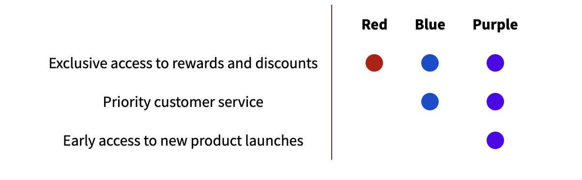
Use this component to render a comparison of the benefits available to each tier. These are (by default) be color coded based on the tier’s color, but can be overridden using CSS. Each td has a CSS class indicating the tier it is a part of (numbered based on position, from 0). For example, to select the benefit status circles in tier-0:
If a benefit is enabled for a tier, it contains a --enabled modifier:
If customer is logged in, it attaches a --current modifier to the tier that customer is currently in:

Code

Preview
Tier benefits compare