> ## Documentation Index
> Fetch the complete documentation index at: https://developers.loyaltylion.com/llms.txt
> Use this file to discover all available pages before exploring further.
# Use a dedicated Shopify page
By default, we render a completely standalone page when rendering as a WebView. This is
the simplest way to get started, but can only be customized with the Theme Editor,
and does not support additional custom CSS, fonts or JavaScript.
Instead, you can create a dedicated Shopify layout and page and we'll
use this when rendering as a WebView. This offers several advantages since you
can customize the page directly within your Shopify Theme, such as adding custom
CSS that will only apply in the mobile app, and any additional JavaScript or
analytics you may need, such as auto-translation.
# Configure your Shopify theme
In your Shopify Theme, create a new layout (in the `layout/` directory)
called `theme.loyaltylion-webview.liquid`.
This will be the layout used when rendering as a mobile WebView, so you should
keep it as small and simple as possible.
* **do not include a `` section in your layout**. This prevents app blocks
from being included in the resulting webview, which is important to ensure
a fast and uncluttered experience when rendering on a mobile device - otherwise
the mobile webview may show cookie warnings, popups, or other UI elements like
offers etc, which are not appropriate for a mobile webview
* include only the CSS that is needed for the LoyaltyLion page, i.e. your main
CSS file that includes fonts, variables, ete. These can be added to the
`` section and will still work fine in the webview
* only include JavaScript that is needed for the LoyaltyLion page (e.g. auto
translation apps), or for analytics. Shopify analytics are included automatically
with the `{{ content_for_header }}` tag
Since every theme is different, we can't provide a one-size-fits-all example that
is guaranteed to work for all themes, but the examples below should work for some
common Shopify themes, and provide a starting point for other themes.
This example isn't linked to any specific Shopify theme, but can be used as a
basic example for other or custom themes.
```html theme={null}
{{ 'theme.css' | asset_url | stylesheet_tag }}
{{ content_for_header }}
{{ content_for_layout }}
```
This example can be used for the older "Debut" theme.
```html theme={null}
{{ 'theme.css' | asset_url | stylesheet_tag }}
{{ content_for_header }}
{{ content_for_layout }}
{% include 'css-variables' %}
```
This example can be used for the "Dawn" theme, and may be applicable for other
themes derived from it.
```html theme={null}
{{ 'base.css' | asset_url | stylesheet_tag }}
{{ content_for_header }}
{{ content_for_layout }}
{% style %}
{{ settings.type_body_font | font_face: font_display: 'swap' }}
{{ body_font_bold | font_face: font_display: 'swap' }}
{{ body_font_italic | font_face: font_display: 'swap' }}
{{ body_font_bold_italic | font_face: font_display: 'swap' }}
{{ settings.type_header_font | font_face: font_display: 'swap' }}
{% for scheme in settings.color_schemes -%}
{% assign scheme_classes = scheme_classes | append: ', .color-' | append: scheme.id %}
{% if forloop.index == 1 -%}
:root,
{%- endif %}
.color-{{ scheme.id }} {
--color-background: {{ scheme.settings.background.red }},{{ scheme.settings.background.green }},{{ scheme.settings.background.blue }};
{% if scheme.settings.background_gradient != empty %}
--gradient-background: {{ scheme.settings.background_gradient }};
{% else %}
--gradient-background: {{ scheme.settings.background }};
{% endif %}
{% liquid
assign background_color = scheme.settings.background
assign background_color_brightness = background_color | color_brightness
if background_color_brightness <= 26
assign background_color_contrast = background_color | color_lighten: 50
elsif background_color_brightness <= 65
assign background_color_contrast = background_color | color_lighten: 5
else
assign background_color_contrast = background_color | color_darken: 25
endif
%}
--color-foreground: {{ scheme.settings.text.red }},{{ scheme.settings.text.green }},{{ scheme.settings.text.blue }};
--color-background-contrast: {{ background_color_contrast.red }},{{ background_color_contrast.green }},{{ background_color_contrast.blue }};
--color-shadow: {{ scheme.settings.shadow.red }},{{ scheme.settings.shadow.green }},{{ scheme.settings.shadow.blue }};
--color-button: {{ scheme.settings.button.red }},{{ scheme.settings.button.green }},{{ scheme.settings.button.blue }};
--color-button-text: {{ scheme.settings.button_label.red }},{{ scheme.settings.button_label.green }},{{ scheme.settings.button_label.blue }};
--color-secondary-button: {{ scheme.settings.background.red }},{{ scheme.settings.background.green }},{{ scheme.settings.background.blue }};
--color-secondary-button-text: {{ scheme.settings.secondary_button_label.red }},{{ scheme.settings.secondary_button_label.green }},{{ scheme.settings.secondary_button_label.blue }};
--color-link: {{ scheme.settings.secondary_button_label.red }},{{ scheme.settings.secondary_button_label.green }},{{ scheme.settings.secondary_button_label.blue }};
--color-badge-foreground: {{ scheme.settings.text.red }},{{ scheme.settings.text.green }},{{ scheme.settings.text.blue }};
--color-badge-background: {{ scheme.settings.background.red }},{{ scheme.settings.background.green }},{{ scheme.settings.background.blue }};
--color-badge-border: {{ scheme.settings.text.red }},{{ scheme.settings.text.green }},{{ scheme.settings.text.blue }};
--payment-terms-background-color: rgb({{ scheme.settings.background.rgb }});
}
{% endfor %}
{{ scheme_classes | prepend: 'body' }} {
color: rgba(var(--color-foreground), 0.75);
background-color: rgb(var(--color-background));
}
:root {
--font-body-family: {{ settings.type_body_font.family }}, {{ settings.type_body_font.fallback_families }};
--font-body-style: {{ settings.type_body_font.style }};
--font-body-weight: {{ settings.type_body_font.weight }};
--font-body-weight-bold: {{ settings.type_body_font.weight | plus: 300 | at_most: 1000 }};
--font-heading-family: {{ settings.type_header_font.family }}, {{ settings.type_header_font.fallback_families }};
--font-heading-style: {{ settings.type_header_font.style }};
--font-heading-weight: {{ settings.type_header_font.weight }};
--font-body-scale: {{ settings.body_scale | divided_by: 100.0 }};
--font-heading-scale: {{ settings.heading_scale | times: 1.0 | divided_by: settings.body_scale }};
--media-padding: {{ settings.media_padding }}px;
--media-border-opacity: {{ settings.media_border_opacity | divided_by: 100.0 }};
--media-border-width: {{ settings.media_border_thickness }}px;
--media-radius: {{ settings.media_radius }}px;
--media-shadow-opacity: {{ settings.media_shadow_opacity | divided_by: 100.0 }};
--media-shadow-horizontal-offset: {{ settings.media_shadow_horizontal_offset }}px;
--media-shadow-vertical-offset: {{ settings.media_shadow_vertical_offset }}px;
--media-shadow-blur-radius: {{ settings.media_shadow_blur }}px;
--media-shadow-visible: {% if settings.media_shadow_opacity > 0 %}1{% else %}0{% endif %};
--page-width: {{ settings.page_width | divided_by: 10 }}rem;
--page-width-margin: {% if settings.page_width == '1600' %}2{% else %}0{% endif %}rem;
--product-card-image-padding: {{ settings.card_image_padding | divided_by: 10.0 }}rem;
--product-card-corner-radius: {{ settings.card_corner_radius | divided_by: 10.0 }}rem;
--product-card-text-alignment: {{ settings.card_text_alignment }};
--product-card-border-width: {{ settings.card_border_thickness | divided_by: 10.0 }}rem;
--product-card-border-opacity: {{ settings.card_border_opacity | divided_by: 100.0 }};
--product-card-shadow-opacity: {{ settings.card_shadow_opacity | divided_by: 100.0 }};
--product-card-shadow-visible: {% if settings.card_shadow_opacity > 0 %}1{% else %}0{% endif %};
--product-card-shadow-horizontal-offset: {{ settings.card_shadow_horizontal_offset | divided_by: 10.0 }}rem;
--product-card-shadow-vertical-offset: {{ settings.card_shadow_vertical_offset | divided_by: 10.0 }}rem;
--product-card-shadow-blur-radius: {{ settings.card_shadow_blur | divided_by: 10.0 }}rem;
--collection-card-image-padding: {{ settings.collection_card_image_padding | divided_by: 10.0 }}rem;
--collection-card-corner-radius: {{ settings.collection_card_corner_radius | divided_by: 10.0 }}rem;
--collection-card-text-alignment: {{ settings.collection_card_text_alignment }};
--collection-card-border-width: {{ settings.collection_card_border_thickness | divided_by: 10.0 }}rem;
--collection-card-border-opacity: {{ settings.collection_card_border_opacity | divided_by: 100.0 }};
--collection-card-shadow-opacity: {{ settings.collection_card_shadow_opacity | divided_by: 100.0 }};
--collection-card-shadow-visible: {% if settings.collection_card_shadow_opacity > 0 %}1{% else %}0{% endif %};
--collection-card-shadow-horizontal-offset: {{ settings.collection_card_shadow_horizontal_offset | divided_by: 10.0 }}rem;
--collection-card-shadow-vertical-offset: {{ settings.collection_card_shadow_vertical_offset | divided_by: 10.0 }}rem;
--collection-card-shadow-blur-radius: {{ settings.collection_card_shadow_blur | divided_by: 10.0 }}rem;
--blog-card-image-padding: {{ settings.blog_card_image_padding | divided_by: 10.0 }}rem;
--blog-card-corner-radius: {{ settings.blog_card_corner_radius | divided_by: 10.0 }}rem;
--blog-card-text-alignment: {{ settings.blog_card_text_alignment }};
--blog-card-border-width: {{ settings.blog_card_border_thickness | divided_by: 10.0 }}rem;
--blog-card-border-opacity: {{ settings.blog_card_border_opacity | divided_by: 100.0 }};
--blog-card-shadow-opacity: {{ settings.blog_card_shadow_opacity | divided_by: 100.0 }};
--blog-card-shadow-visible: {% if settings.blog_card_shadow_opacity > 0 %}1{% else %}0{% endif %};
--blog-card-shadow-horizontal-offset: {{ settings.blog_card_shadow_horizontal_offset | divided_by: 10.0 }}rem;
--blog-card-shadow-vertical-offset: {{ settings.blog_card_shadow_vertical_offset | divided_by: 10.0 }}rem;
--blog-card-shadow-blur-radius: {{ settings.blog_card_shadow_blur | divided_by: 10.0 }}rem;
--badge-corner-radius: {{ settings.badge_corner_radius | divided_by: 10.0 }}rem;
--popup-border-width: {{ settings.popup_border_thickness }}px;
--popup-border-opacity: {{ settings.popup_border_opacity | divided_by: 100.0 }};
--popup-corner-radius: {{ settings.popup_corner_radius }}px;
--popup-shadow-opacity: {{ settings.popup_shadow_opacity | divided_by: 100.0 }};
--popup-shadow-horizontal-offset: {{ settings.popup_shadow_horizontal_offset }}px;
--popup-shadow-vertical-offset: {{ settings.popup_shadow_vertical_offset }}px;
--popup-shadow-blur-radius: {{ settings.popup_shadow_blur }}px;
--drawer-border-width: {{ settings.drawer_border_thickness }}px;
--drawer-border-opacity: {{ settings.drawer_border_opacity | divided_by: 100.0 }};
--drawer-shadow-opacity: {{ settings.drawer_shadow_opacity | divided_by: 100.0 }};
--drawer-shadow-horizontal-offset: {{ settings.drawer_shadow_horizontal_offset }}px;
--drawer-shadow-vertical-offset: {{ settings.drawer_shadow_vertical_offset }}px;
--drawer-shadow-blur-radius: {{ settings.drawer_shadow_blur }}px;
--spacing-sections-desktop: {{ settings.spacing_sections }}px;
--spacing-sections-mobile: {% if settings.spacing_sections < 24 %}{{ settings.spacing_sections }}{% else %}{{ settings.spacing_sections | times: 0.7 | round | at_least: 20 }}{% endif %}px;
--grid-desktop-vertical-spacing: {{ settings.spacing_grid_vertical }}px;
--grid-desktop-horizontal-spacing: {{ settings.spacing_grid_horizontal }}px;
--grid-mobile-vertical-spacing: {{ settings.spacing_grid_vertical | divided_by: 2 }}px;
--grid-mobile-horizontal-spacing: {{ settings.spacing_grid_horizontal | divided_by: 2 }}px;
--text-boxes-border-opacity: {{ settings.text_boxes_border_opacity | divided_by: 100.0 }};
--text-boxes-border-width: {{ settings.text_boxes_border_thickness }}px;
--text-boxes-radius: {{ settings.text_boxes_radius }}px;
--text-boxes-shadow-opacity: {{ settings.text_boxes_shadow_opacity | divided_by: 100.0 }};
--text-boxes-shadow-visible: {% if settings.text_boxes_shadow_opacity > 0 %}1{% else %}0{% endif %};
--text-boxes-shadow-horizontal-offset: {{ settings.text_boxes_shadow_horizontal_offset }}px;
--text-boxes-shadow-vertical-offset: {{ settings.text_boxes_shadow_vertical_offset }}px;
--text-boxes-shadow-blur-radius: {{ settings.text_boxes_shadow_blur }}px;
--buttons-radius: {{ settings.buttons_radius }}px;
--buttons-radius-outset: {% if settings.buttons_radius > 0 %}{{ settings.buttons_radius | plus: settings.buttons_border_thickness }}{% else %}0{% endif %}px;
--buttons-border-width: {% if settings.buttons_border_opacity > 0 %}{{ settings.buttons_border_thickness }}{% else %}0{% endif %}px;
--buttons-border-opacity: {{ settings.buttons_border_opacity | divided_by: 100.0 }};
--buttons-shadow-opacity: {{ settings.buttons_shadow_opacity | divided_by: 100.0 }};
--buttons-shadow-visible: {% if settings.buttons_shadow_opacity > 0 %}1{% else %}0{% endif %};
--buttons-shadow-horizontal-offset: {{ settings.buttons_shadow_horizontal_offset }}px;
--buttons-shadow-vertical-offset: {{ settings.buttons_shadow_vertical_offset }}px;
--buttons-shadow-blur-radius: {{ settings.buttons_shadow_blur }}px;
--buttons-border-offset: {% if settings.buttons_radius > 0 or settings.buttons_shadow_opacity > 0 %}0.3{% else %}0{% endif %}px;
--inputs-radius: {{ settings.inputs_radius }}px;
--inputs-border-width: {{ settings.inputs_border_thickness }}px;
--inputs-border-opacity: {{ settings.inputs_border_opacity | divided_by: 100.0 }};
--inputs-shadow-opacity: {{ settings.inputs_shadow_opacity | divided_by: 100.0 }};
--inputs-shadow-horizontal-offset: {{ settings.inputs_shadow_horizontal_offset }}px;
--inputs-margin-offset: {% if settings.inputs_shadow_vertical_offset != 0 and settings.inputs_shadow_opacity > 0 %}{{ settings.inputs_shadow_vertical_offset | abs }}{% else %}0{% endif %}px;
--inputs-shadow-vertical-offset: {{ settings.inputs_shadow_vertical_offset }}px;
--inputs-shadow-blur-radius: {{ settings.inputs_shadow_blur }}px;
--inputs-radius-outset: {% if settings.inputs_radius > 0 %}{{ settings.inputs_radius | plus: settings.inputs_border_thickness }}{% else %}0{% endif %}px;
--variant-pills-radius: {{ settings.variant_pills_radius }}px;
--variant-pills-border-width: {{ settings.variant_pills_border_thickness }}px;
--variant-pills-border-opacity: {{ settings.variant_pills_border_opacity | divided_by: 100.0 }};
--variant-pills-shadow-opacity: {{ settings.variant_pills_shadow_opacity | divided_by: 100.0 }};
--variant-pills-shadow-horizontal-offset: {{ settings.variant_pills_shadow_horizontal_offset }}px;
--variant-pills-shadow-vertical-offset: {{ settings.variant_pills_shadow_vertical_offset }}px;
--variant-pills-shadow-blur-radius: {{ settings.variant_pills_shadow_blur }}px;
}
*,
*::before,
*::after {
box-sizing: inherit;
}
html {
box-sizing: border-box;
font-size: calc(var(--font-body-scale) * 62.5%);
height: 100%;
}
body {
margin: 0;
font-size: 1.5rem;
letter-spacing: 0.06rem;
line-height: calc(1 + 0.8 / var(--font-body-scale));
font-family: var(--font-body-family);
font-style: var(--font-body-style);
font-weight: var(--font-body-weight);
}
@media screen and (min-width: 750px) {
body {
font-size: 1.6rem;
}
}
{% endstyle %}
```
This example can be used for the "Rise" theme.
```html theme={null}
{{ 'base.css' | asset_url | stylesheet_tag }}
{{ content_for_header }}
{{ content_for_layout }}
{% style %}
{{ settings.type_body_font | font_face: font_display: 'swap' }}
{{ body_font_bold | font_face: font_display: 'swap' }}
{{ body_font_italic | font_face: font_display: 'swap' }}
{{ body_font_bold_italic | font_face: font_display: 'swap' }}
{{ settings.type_header_font | font_face: font_display: 'swap' }}
{% for scheme in settings.color_schemes -%}
{% assign scheme_classes = scheme_classes | append: ', .color-' | append: scheme.id %}
{% if forloop.index == 1 -%}
:root,
{%- endif %}
.color-{{ scheme.id }} {
--color-background: {{ scheme.settings.background.red }},{{ scheme.settings.background.green }},{{ scheme.settings.background.blue }};
{% if scheme.settings.background_gradient != empty %}
--gradient-background: {{ scheme.settings.background_gradient }};
{% else %}
--gradient-background: {{ scheme.settings.background }};
{% endif %}
{% liquid
assign background_color = scheme.settings.background
assign background_color_brightness = background_color | color_brightness
if background_color_brightness <= 26
assign background_color_contrast = background_color | color_lighten: 50
elsif background_color_brightness <= 65
assign background_color_contrast = background_color | color_lighten: 5
else
assign background_color_contrast = background_color | color_darken: 25
endif
%}
--color-foreground: {{ scheme.settings.text.red }},{{ scheme.settings.text.green }},{{ scheme.settings.text.blue }};
--color-background-contrast: {{ background_color_contrast.red }},{{ background_color_contrast.green }},{{ background_color_contrast.blue }};
--color-shadow: {{ scheme.settings.shadow.red }},{{ scheme.settings.shadow.green }},{{ scheme.settings.shadow.blue }};
--color-button: {{ scheme.settings.button.red }},{{ scheme.settings.button.green }},{{ scheme.settings.button.blue }};
--color-button-text: {{ scheme.settings.button_label.red }},{{ scheme.settings.button_label.green }},{{ scheme.settings.button_label.blue }};
--color-secondary-button: {{ scheme.settings.background.red }},{{ scheme.settings.background.green }},{{ scheme.settings.background.blue }};
--color-secondary-button-text: {{ scheme.settings.secondary_button_label.red }},{{ scheme.settings.secondary_button_label.green }},{{ scheme.settings.secondary_button_label.blue }};
--color-link: {{ scheme.settings.secondary_button_label.red }},{{ scheme.settings.secondary_button_label.green }},{{ scheme.settings.secondary_button_label.blue }};
--color-badge-foreground: {{ scheme.settings.text.red }},{{ scheme.settings.text.green }},{{ scheme.settings.text.blue }};
--color-badge-background: {{ scheme.settings.background.red }},{{ scheme.settings.background.green }},{{ scheme.settings.background.blue }};
--color-badge-border: {{ scheme.settings.text.red }},{{ scheme.settings.text.green }},{{ scheme.settings.text.blue }};
--payment-terms-background-color: rgb({{ scheme.settings.background.rgb }});
}
{% endfor %}
{{ scheme_classes | prepend: 'body' }} {
color: rgba(var(--color-foreground), 0.75);
background-color: rgb(var(--color-background));
}
:root {
--font-body-family: {{ settings.type_body_font.family }}, {{ settings.type_body_font.fallback_families }};
--font-body-style: {{ settings.type_body_font.style }};
--font-body-weight: {{ settings.type_body_font.weight }};
--font-body-weight-bold: {{ settings.type_body_font.weight | plus: 300 | at_most: 1000 }};
--font-heading-family: {{ settings.type_header_font.family }}, {{ settings.type_header_font.fallback_families }};
--font-heading-style: {{ settings.type_header_font.style }};
--font-heading-weight: {{ settings.type_header_font.weight }};
--font-body-scale: {{ settings.body_scale | divided_by: 100.0 }};
--font-heading-scale: {{ settings.heading_scale | times: 1.0 | divided_by: settings.body_scale }};
--media-padding: {{ settings.media_padding }}px;
--media-border-opacity: {{ settings.media_border_opacity | divided_by: 100.0 }};
--media-border-width: {{ settings.media_border_thickness }}px;
--media-radius: {{ settings.media_radius }}px;
--media-shadow-opacity: {{ settings.media_shadow_opacity | divided_by: 100.0 }};
--media-shadow-horizontal-offset: {{ settings.media_shadow_horizontal_offset }}px;
--media-shadow-vertical-offset: {{ settings.media_shadow_vertical_offset }}px;
--media-shadow-blur-radius: {{ settings.media_shadow_blur }}px;
--media-shadow-visible: {% if settings.media_shadow_opacity > 0 %}1{% else %}0{% endif %};
--page-width: {{ settings.page_width | divided_by: 10 }}rem;
--page-width-margin: {% if settings.page_width == '1600' %}2{% else %}0{% endif %}rem;
--product-card-image-padding: {{ settings.card_image_padding | divided_by: 10.0 }}rem;
--product-card-corner-radius: {{ settings.card_corner_radius | divided_by: 10.0 }}rem;
--product-card-text-alignment: {{ settings.card_text_alignment }};
--product-card-border-width: {{ settings.card_border_thickness | divided_by: 10.0 }}rem;
--product-card-border-opacity: {{ settings.card_border_opacity | divided_by: 100.0 }};
--product-card-shadow-opacity: {{ settings.card_shadow_opacity | divided_by: 100.0 }};
--product-card-shadow-visible: {% if settings.card_shadow_opacity > 0 %}1{% else %}0{% endif %};
--product-card-shadow-horizontal-offset: {{ settings.card_shadow_horizontal_offset | divided_by: 10.0 }}rem;
--product-card-shadow-vertical-offset: {{ settings.card_shadow_vertical_offset | divided_by: 10.0 }}rem;
--product-card-shadow-blur-radius: {{ settings.card_shadow_blur | divided_by: 10.0 }}rem;
--collection-card-image-padding: {{ settings.collection_card_image_padding | divided_by: 10.0 }}rem;
--collection-card-corner-radius: {{ settings.collection_card_corner_radius | divided_by: 10.0 }}rem;
--collection-card-text-alignment: {{ settings.collection_card_text_alignment }};
--collection-card-border-width: {{ settings.collection_card_border_thickness | divided_by: 10.0 }}rem;
--collection-card-border-opacity: {{ settings.collection_card_border_opacity | divided_by: 100.0 }};
--collection-card-shadow-opacity: {{ settings.collection_card_shadow_opacity | divided_by: 100.0 }};
--collection-card-shadow-visible: {% if settings.collection_card_shadow_opacity > 0 %}1{% else %}0{% endif %};
--collection-card-shadow-horizontal-offset: {{ settings.collection_card_shadow_horizontal_offset | divided_by: 10.0 }}rem;
--collection-card-shadow-vertical-offset: {{ settings.collection_card_shadow_vertical_offset | divided_by: 10.0 }}rem;
--collection-card-shadow-blur-radius: {{ settings.collection_card_shadow_blur | divided_by: 10.0 }}rem;
--blog-card-image-padding: {{ settings.blog_card_image_padding | divided_by: 10.0 }}rem;
--blog-card-corner-radius: {{ settings.blog_card_corner_radius | divided_by: 10.0 }}rem;
--blog-card-text-alignment: {{ settings.blog_card_text_alignment }};
--blog-card-border-width: {{ settings.blog_card_border_thickness | divided_by: 10.0 }}rem;
--blog-card-border-opacity: {{ settings.blog_card_border_opacity | divided_by: 100.0 }};
--blog-card-shadow-opacity: {{ settings.blog_card_shadow_opacity | divided_by: 100.0 }};
--blog-card-shadow-visible: {% if settings.blog_card_shadow_opacity > 0 %}1{% else %}0{% endif %};
--blog-card-shadow-horizontal-offset: {{ settings.blog_card_shadow_horizontal_offset | divided_by: 10.0 }}rem;
--blog-card-shadow-vertical-offset: {{ settings.blog_card_shadow_vertical_offset | divided_by: 10.0 }}rem;
--blog-card-shadow-blur-radius: {{ settings.blog_card_shadow_blur | divided_by: 10.0 }}rem;
--badge-corner-radius: {{ settings.badge_corner_radius | divided_by: 10.0 }}rem;
--popup-border-width: {{ settings.popup_border_thickness }}px;
--popup-border-opacity: {{ settings.popup_border_opacity | divided_by: 100.0 }};
--popup-corner-radius: {{ settings.popup_corner_radius }}px;
--popup-shadow-opacity: {{ settings.popup_shadow_opacity | divided_by: 100.0 }};
--popup-shadow-horizontal-offset: {{ settings.popup_shadow_horizontal_offset }}px;
--popup-shadow-vertical-offset: {{ settings.popup_shadow_vertical_offset }}px;
--popup-shadow-blur-radius: {{ settings.popup_shadow_blur }}px;
--drawer-border-width: {{ settings.drawer_border_thickness }}px;
--drawer-border-opacity: {{ settings.drawer_border_opacity | divided_by: 100.0 }};
--drawer-shadow-opacity: {{ settings.drawer_shadow_opacity | divided_by: 100.0 }};
--drawer-shadow-horizontal-offset: {{ settings.drawer_shadow_horizontal_offset }}px;
--drawer-shadow-vertical-offset: {{ settings.drawer_shadow_vertical_offset }}px;
--drawer-shadow-blur-radius: {{ settings.drawer_shadow_blur }}px;
--spacing-sections-desktop: {{ settings.spacing_sections }}px;
--spacing-sections-mobile: {% if settings.spacing_sections < 24 %}{{ settings.spacing_sections }}{% else %}{{ settings.spacing_sections | times: 0.7 | round | at_least: 20 }}{% endif %}px;
--grid-desktop-vertical-spacing: {{ settings.spacing_grid_vertical }}px;
--grid-desktop-horizontal-spacing: {{ settings.spacing_grid_horizontal }}px;
--grid-mobile-vertical-spacing: {{ settings.spacing_grid_vertical | divided_by: 2 }}px;
--grid-mobile-horizontal-spacing: {{ settings.spacing_grid_horizontal | divided_by: 2 }}px;
--text-boxes-border-opacity: {{ settings.text_boxes_border_opacity | divided_by: 100.0 }};
--text-boxes-border-width: {{ settings.text_boxes_border_thickness }}px;
--text-boxes-radius: {{ settings.text_boxes_radius }}px;
--text-boxes-shadow-opacity: {{ settings.text_boxes_shadow_opacity | divided_by: 100.0 }};
--text-boxes-shadow-visible: {% if settings.text_boxes_shadow_opacity > 0 %}1{% else %}0{% endif %};
--text-boxes-shadow-horizontal-offset: {{ settings.text_boxes_shadow_horizontal_offset }}px;
--text-boxes-shadow-vertical-offset: {{ settings.text_boxes_shadow_vertical_offset }}px;
--text-boxes-shadow-blur-radius: {{ settings.text_boxes_shadow_blur }}px;
--buttons-radius: {{ settings.buttons_radius }}px;
--buttons-radius-outset: {% if settings.buttons_radius > 0 %}{{ settings.buttons_radius | plus: settings.buttons_border_thickness }}{% else %}0{% endif %}px;
--buttons-border-width: {% if settings.buttons_border_opacity > 0 %}{{ settings.buttons_border_thickness }}{% else %}0{% endif %}px;
--buttons-border-opacity: {{ settings.buttons_border_opacity | divided_by: 100.0 }};
--buttons-shadow-opacity: {{ settings.buttons_shadow_opacity | divided_by: 100.0 }};
--buttons-shadow-visible: {% if settings.buttons_shadow_opacity > 0 %}1{% else %}0{% endif %};
--buttons-shadow-horizontal-offset: {{ settings.buttons_shadow_horizontal_offset }}px;
--buttons-shadow-vertical-offset: {{ settings.buttons_shadow_vertical_offset }}px;
--buttons-shadow-blur-radius: {{ settings.buttons_shadow_blur }}px;
--buttons-border-offset: {% if settings.buttons_radius > 0 or settings.buttons_shadow_opacity > 0 %}0.3{% else %}0{% endif %}px;
--inputs-radius: {{ settings.inputs_radius }}px;
--inputs-border-width: {{ settings.inputs_border_thickness }}px;
--inputs-border-opacity: {{ settings.inputs_border_opacity | divided_by: 100.0 }};
--inputs-shadow-opacity: {{ settings.inputs_shadow_opacity | divided_by: 100.0 }};
--inputs-shadow-horizontal-offset: {{ settings.inputs_shadow_horizontal_offset }}px;
--inputs-margin-offset: {% if settings.inputs_shadow_vertical_offset != 0 and settings.inputs_shadow_opacity > 0 %}{{ settings.inputs_shadow_vertical_offset | abs }}{% else %}0{% endif %}px;
--inputs-shadow-vertical-offset: {{ settings.inputs_shadow_vertical_offset }}px;
--inputs-shadow-blur-radius: {{ settings.inputs_shadow_blur }}px;
--inputs-radius-outset: {% if settings.inputs_radius > 0 %}{{ settings.inputs_radius | plus: settings.inputs_border_thickness }}{% else %}0{% endif %}px;
--variant-pills-radius: {{ settings.variant_pills_radius }}px;
--variant-pills-border-width: {{ settings.variant_pills_border_thickness }}px;
--variant-pills-border-opacity: {{ settings.variant_pills_border_opacity | divided_by: 100.0 }};
--variant-pills-shadow-opacity: {{ settings.variant_pills_shadow_opacity | divided_by: 100.0 }};
--variant-pills-shadow-horizontal-offset: {{ settings.variant_pills_shadow_horizontal_offset }}px;
--variant-pills-shadow-vertical-offset: {{ settings.variant_pills_shadow_vertical_offset }}px;
--variant-pills-shadow-blur-radius: {{ settings.variant_pills_shadow_blur }}px;
}
*,
*::before,
*::after {
box-sizing: inherit;
}
html {
box-sizing: border-box;
font-size: calc(var(--font-body-scale) * 62.5%);
height: 100%;
}
body {
display: grid;
grid-template-rows: auto auto 1fr auto;
grid-template-columns: 100%;
min-height: 100%;
margin: 0;
font-size: 1.5rem;
letter-spacing: 0.06rem;
line-height: calc(1 + 0.8 / var(--font-body-scale));
font-family: var(--font-body-family);
font-style: var(--font-body-style);
font-weight: var(--font-body-weight);
}
@media screen and (min-width: 750px) {
body {
font-size: 1.6rem;
}
}
{% endstyle %}
```
Create a new CSS file (in the `assets/` directory) called
`loyaltylion-webview.css`, with the following content.
You can leave this file blank for now; any CSS in this file will apply exclusively
to the Loyalty Page when it's rendered as in your mobile app as a WebView.
In your Shopify Theme, create a new section (in the `sections/` directory)
called `loyaltylion-webview.liquid`, with the following content:
```html theme={null}
{{ 'loyaltylion-webview.css' | asset_url | stylesheet_tag }}
{{ page.content }}
{% schema %}
{
"name": "t:sections.loyaltylion-webview.name",
"tag": "section",
"class": "section",
"settings": []
}
{% endschema %}
```
In your Shopify Theme, create a new template (in the `templates/` directory)
called `page.loyaltylion-webview.json`, with the following content:
```json theme={null}
{
"layout": "theme.loyaltylion-webview",
"sections": {
"main": {
"type": "loyaltylion-webview",
"settings": {}
}
},
"order": [
"main"
]
}
```
This simple template, when applied to a page, will render the page using the
new layout and section we created in the previous steps.
## Set up a new Shopify page
### Create a new page
Once your Shopify Theme has been configured, we need to create a new page and
apply the new page template to it. This will be the actual page that will be
rendered inside the WebView.
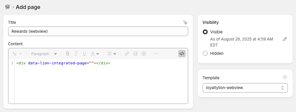 * We recommend naming the page "Rewards (webview)" to distinguish it from any
other loyalty pages
* Configure the page to use the `loyaltylion-webview` template
For the page content, switch to HTML mode and paste in the following:
```html theme={null}
```
### Preview and customize the page
Assuming LoyaltyLion is already installed and launched on your store, you can
open this new page to preview how the Loyalty Page will look, and
add any customizations you need to make using custom CSS added to the
`loyaltylion-webview.css`
Because the page will be rendered in a full-screen webview, we recommend that
the page renders using 100% width, i.e. is not rendered inside a grid container
and limited to a specific width.
### Share the page URL with us
Once you're happy with how the page looks, share the page URL with your
LoyaltyLion account manager or [our support
team](mailto:support@loyaltylion.com) and we'll configure it as your WebView page.
* We recommend naming the page "Rewards (webview)" to distinguish it from any
other loyalty pages
* Configure the page to use the `loyaltylion-webview` template
For the page content, switch to HTML mode and paste in the following:
```html theme={null}
```
### Preview and customize the page
Assuming LoyaltyLion is already installed and launched on your store, you can
open this new page to preview how the Loyalty Page will look, and
add any customizations you need to make using custom CSS added to the
`loyaltylion-webview.css`
Because the page will be rendered in a full-screen webview, we recommend that
the page renders using 100% width, i.e. is not rendered inside a grid container
and limited to a specific width.
### Share the page URL with us
Once you're happy with how the page looks, share the page URL with your
LoyaltyLion account manager or [our support
team](mailto:support@loyaltylion.com) and we'll configure it as your WebView page.